(These Guidelines were last reviewed 02/09/2026)
These guidelines are for graphic elements and text in CHOP videos. Adhering to CHOP brand standards and ensuring readability on mobile are among the goals of the guidelines. As you familiarize with the elements and definitions outlined in this guide, you may identify other uses for the elements. IE: What is identified as Lower Thirds design elements may work well in other use cases to present text onscreen.
These guidelines include information for video in 1920×1080, 1080×1080, and 1080×1920 formats.
Topics Covered: Brand Tenents | Margins | CHOP Watermark | Lower Thirds | Headline & Story Text | Background Colors | Call-outs | Special Use Captions | Square & Vertical Video | YouTube Paid Ads
Download our Storyboard Starter Kit! (includes CHOP brand fonts and AI file with margins and design patterns for layout)
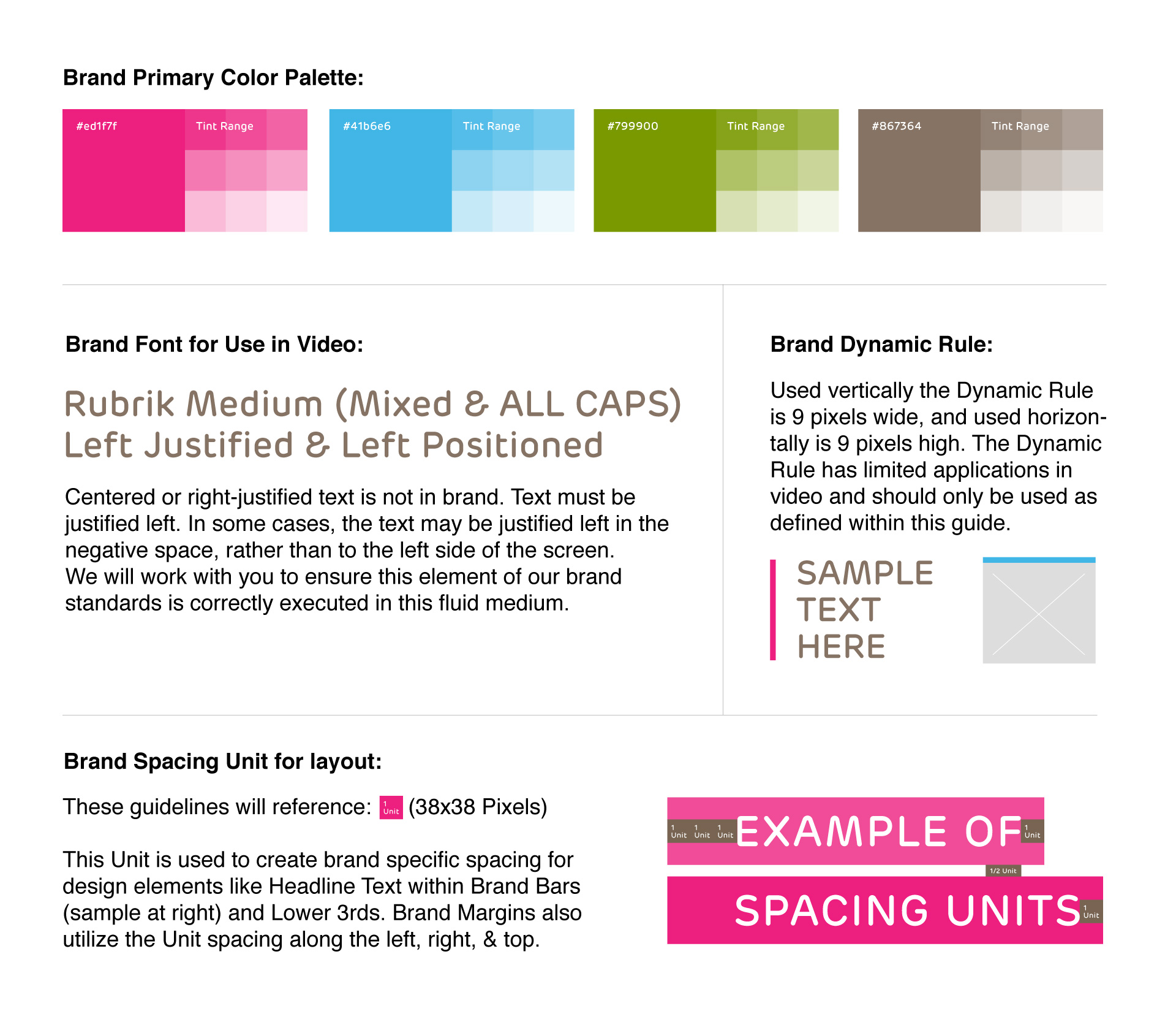
Brand Tenents
Basic Brand Elements: Fonts, Colors, Dynamic Rule and Brand Spacing Unit
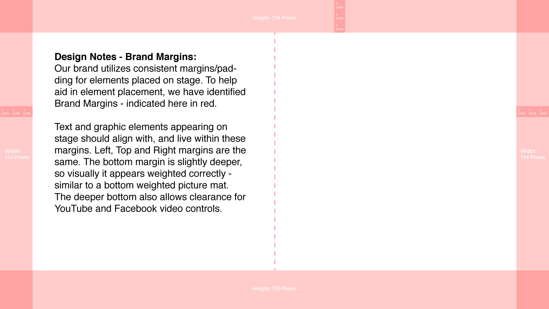
Margins
Brand Margins
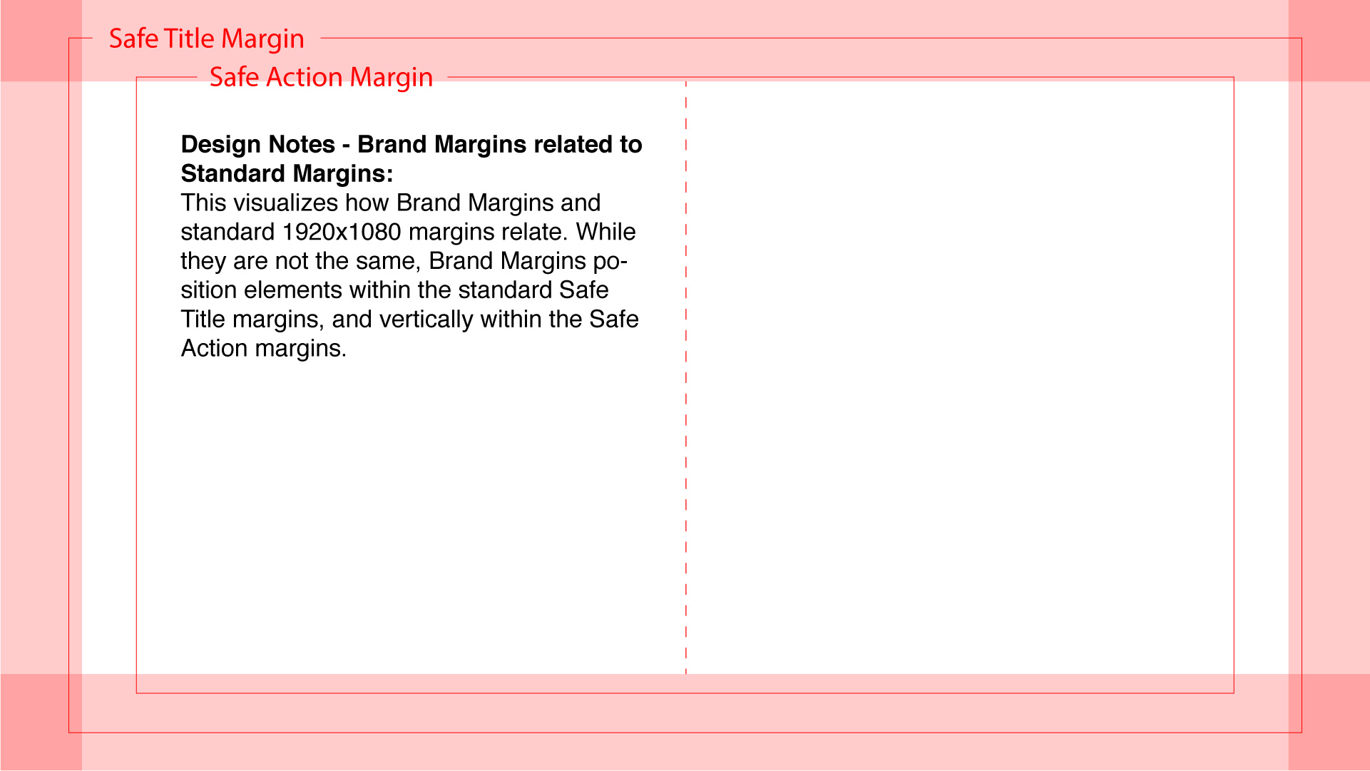
Brand Margins Related to Standard Video Editing Safe Margins
Would template PNG files for our Brand Margins help you? Download ZIP here!
ZIP file includes 3 PNG files, 1 file for each – Horizontal (1920×1080), Square (1080×1080), and Vertical (1080×1920) video formats.
CHOP Watermark
The watermark is evergreen for all horizontal videos. There may be times when a watermark needs to hide momentarily to allow content to display, but should re-appear in the same position as soon as possible.
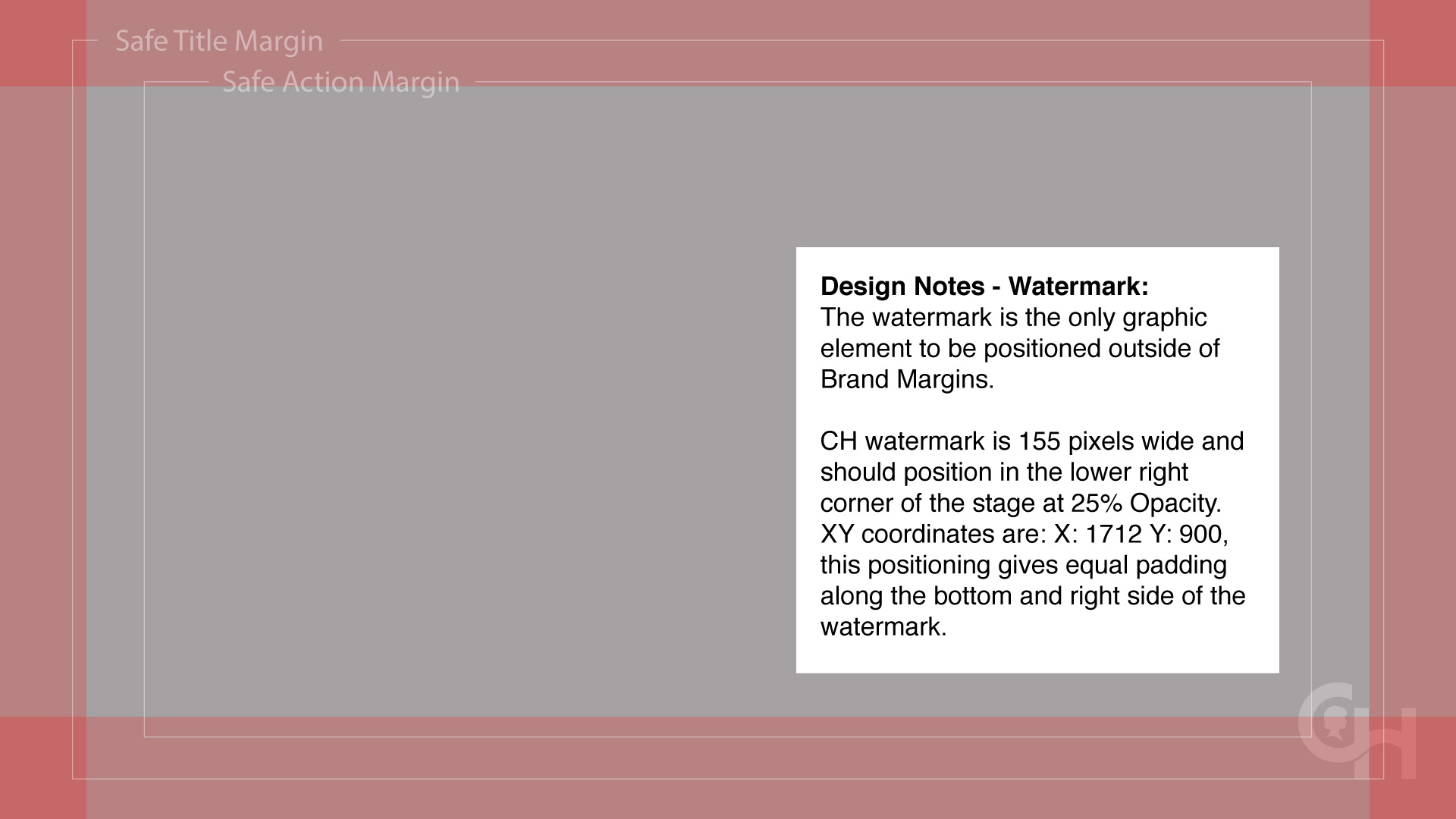
Would you like a transparent PNG file of the CH watermark to use in your video editing software? Download the CH Watermark
This watermark has built in right and bottom margins to help correctly position it in the bottom right of your video. Import the PNG into your video editing software, and then simply bottom and right align the PNG to the stage of your video. Within the video editing software please set the opacity of the watermark to 25%. Note: this PNG is sized for video created at 1920×1080, 1080×1920 and 1080×1080.
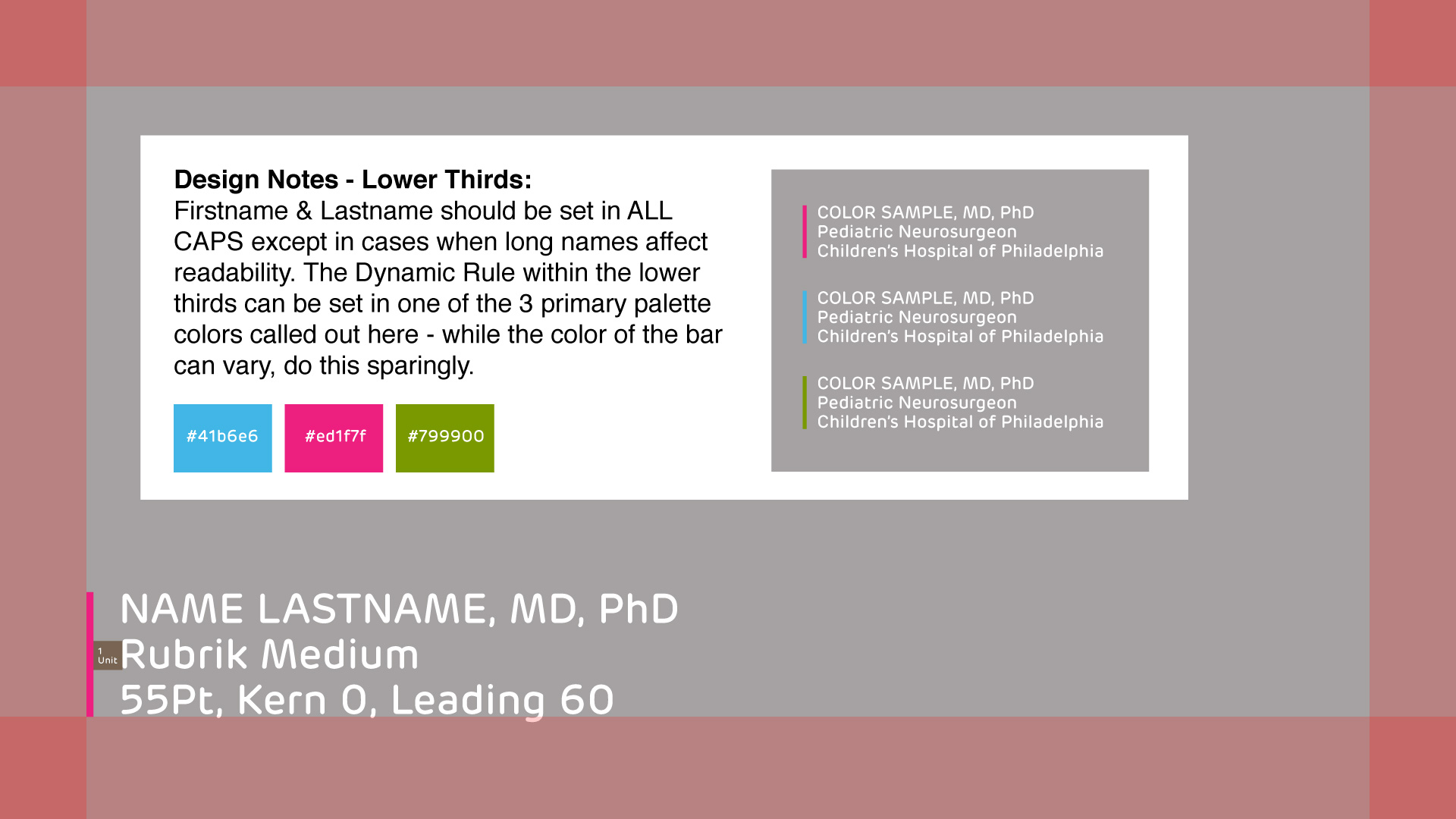
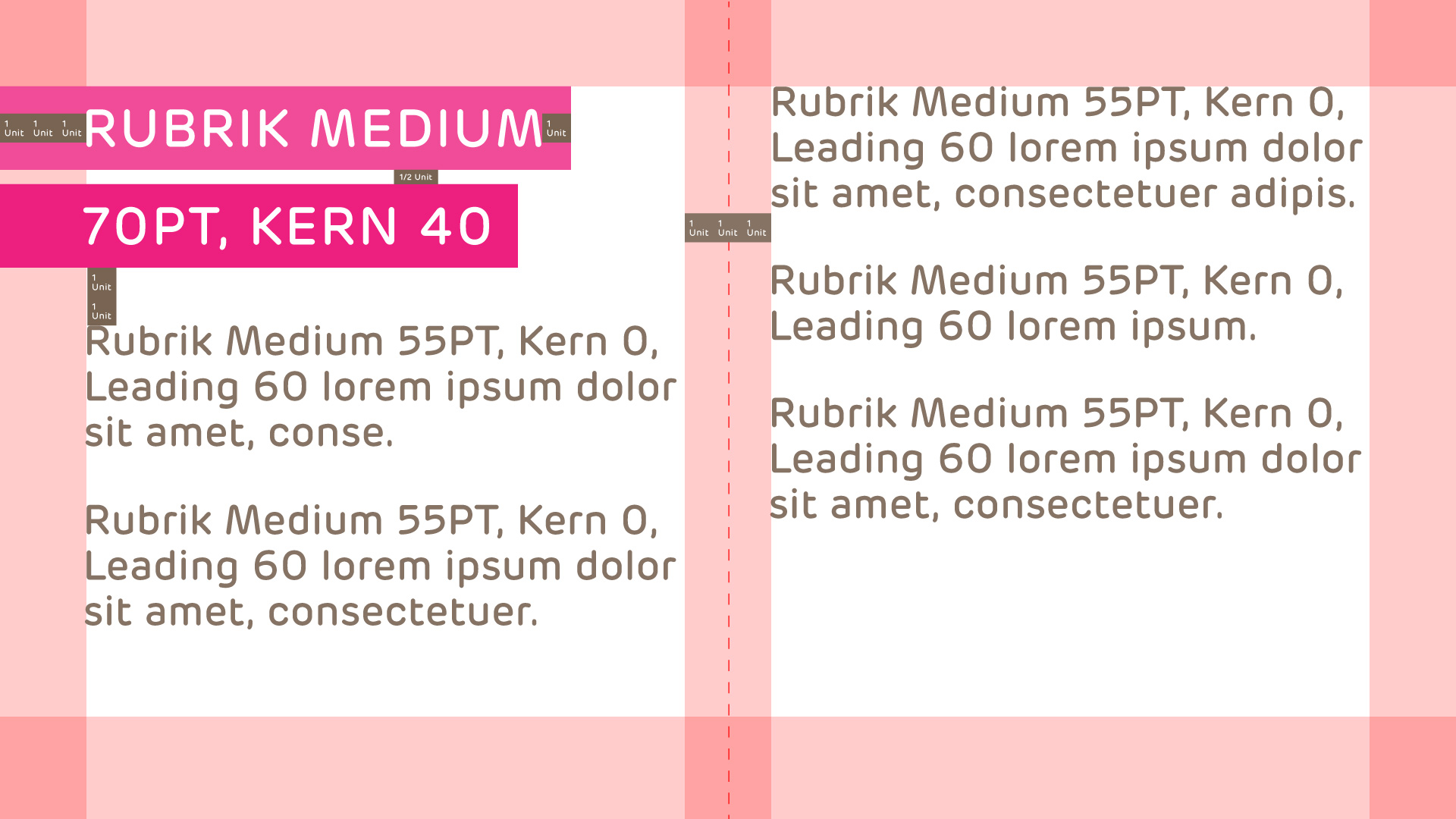
Lower Thirds
Use the format below for lower thirds. In most cases, lower thirds should be positioned in the lower left. We are open to exceptions when the visual dictates. Throughout this guide we reference Fonts in Point size – easily convert points to pixels here.
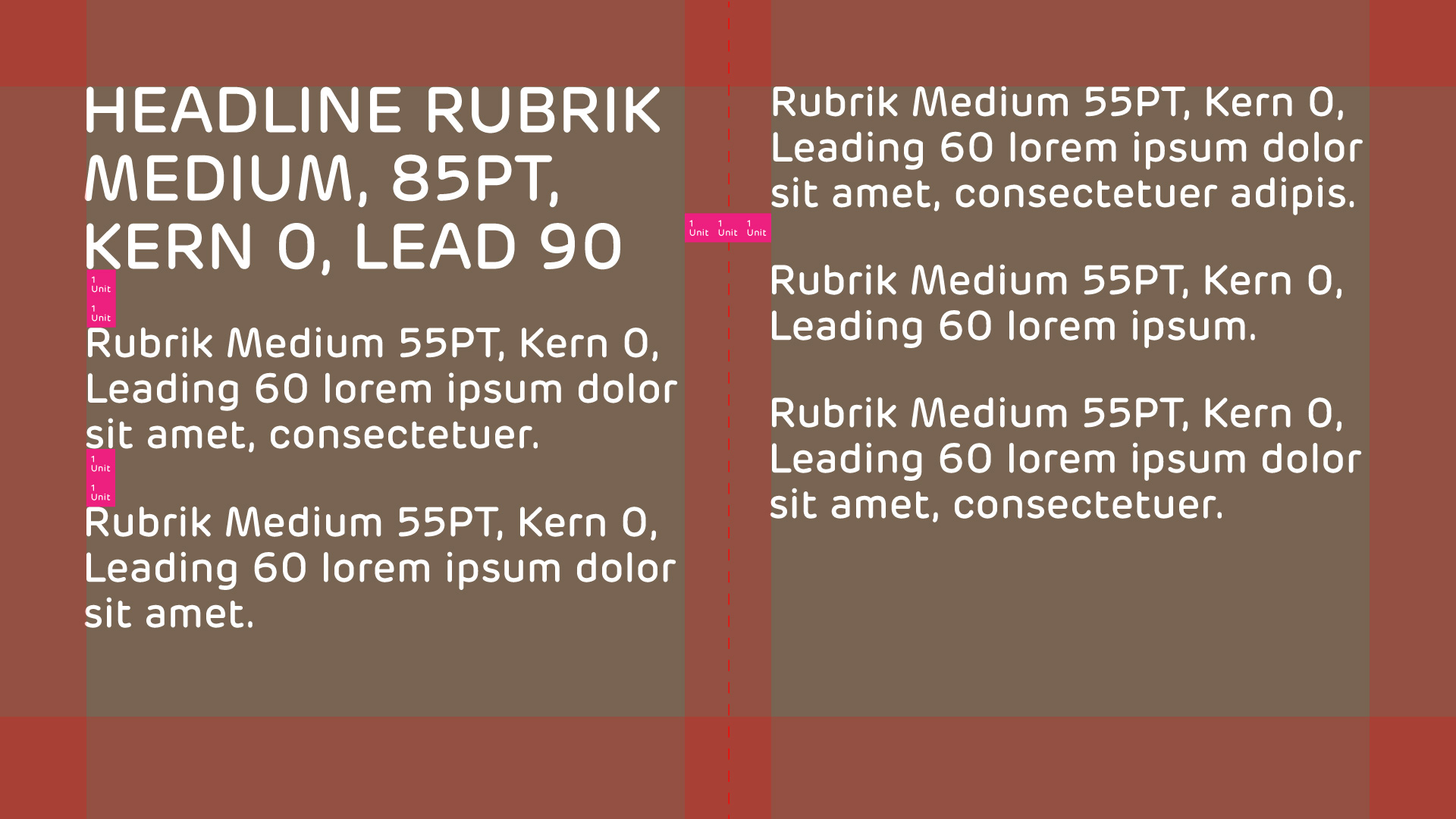
Headline & Story Text
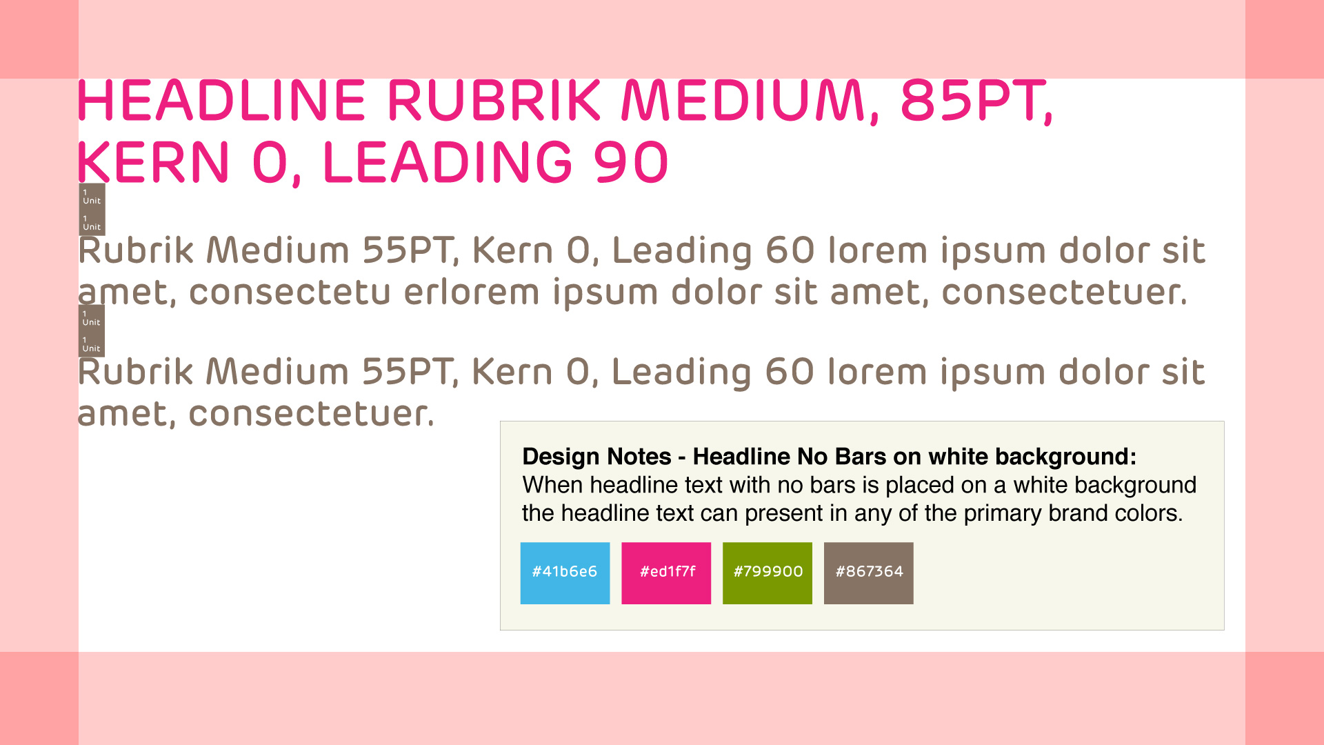
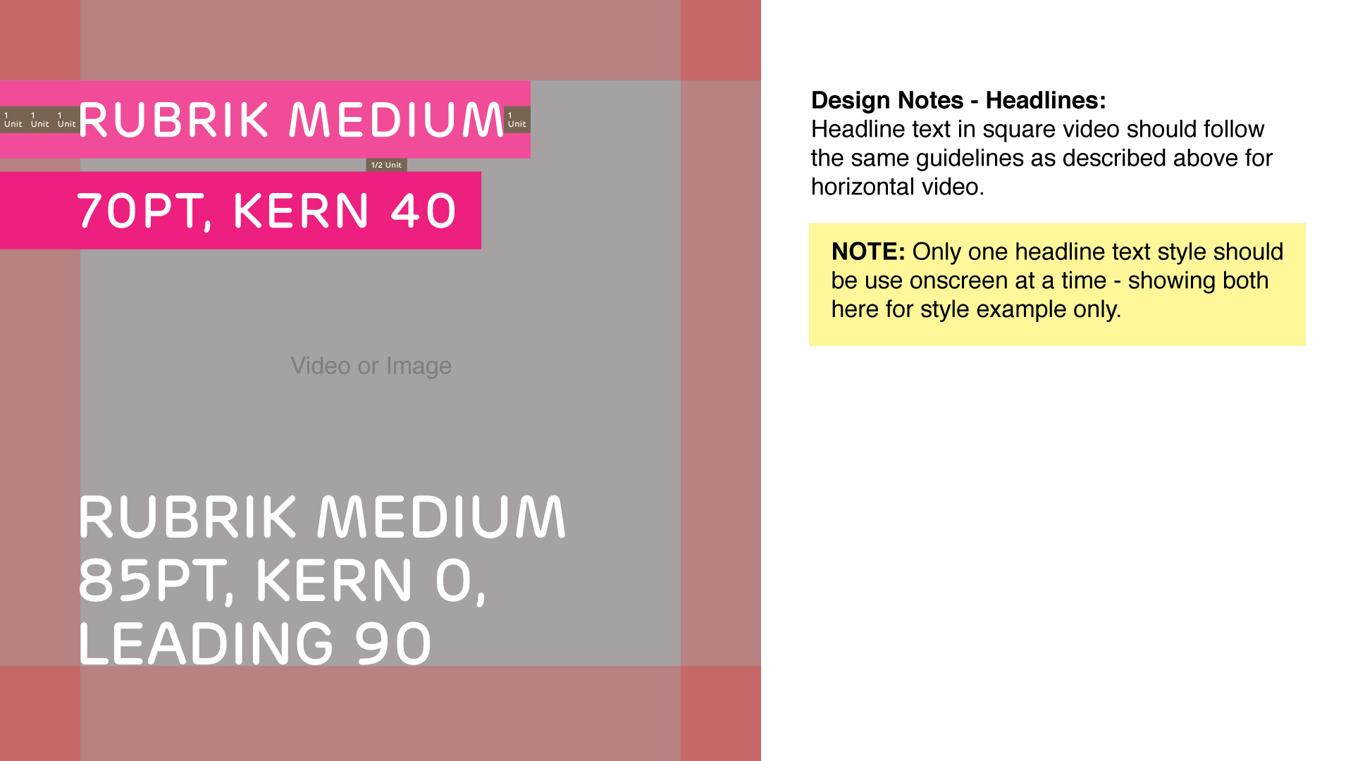
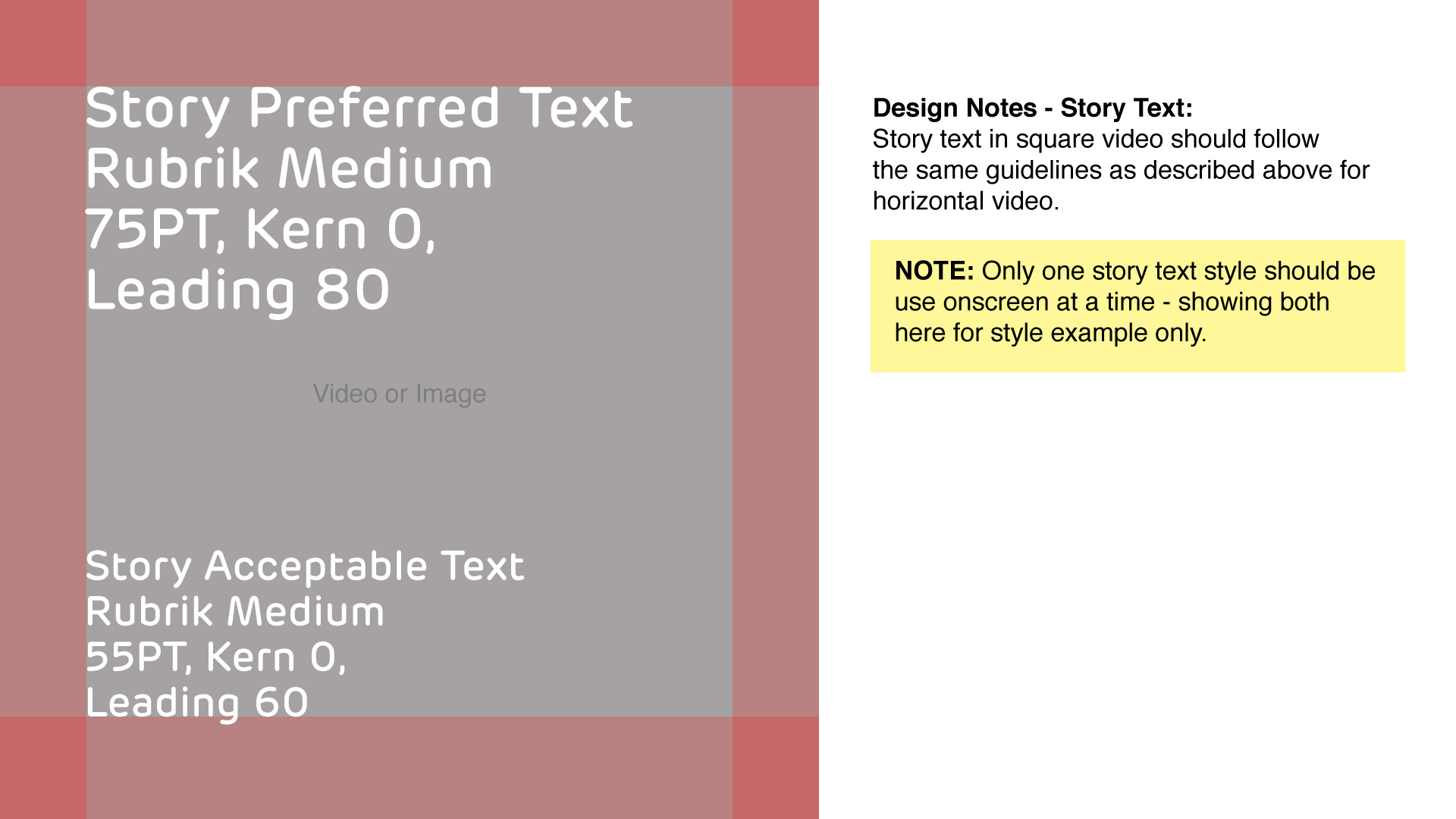
Generally, headline and story text should horizontally align with the left side brand margin, and vertically position upper left, lower left or vertically centered. We are open to exceptions when the visual dictates. Throughout this guide we reference Fonts in Point size – easily convert points to pixels here.
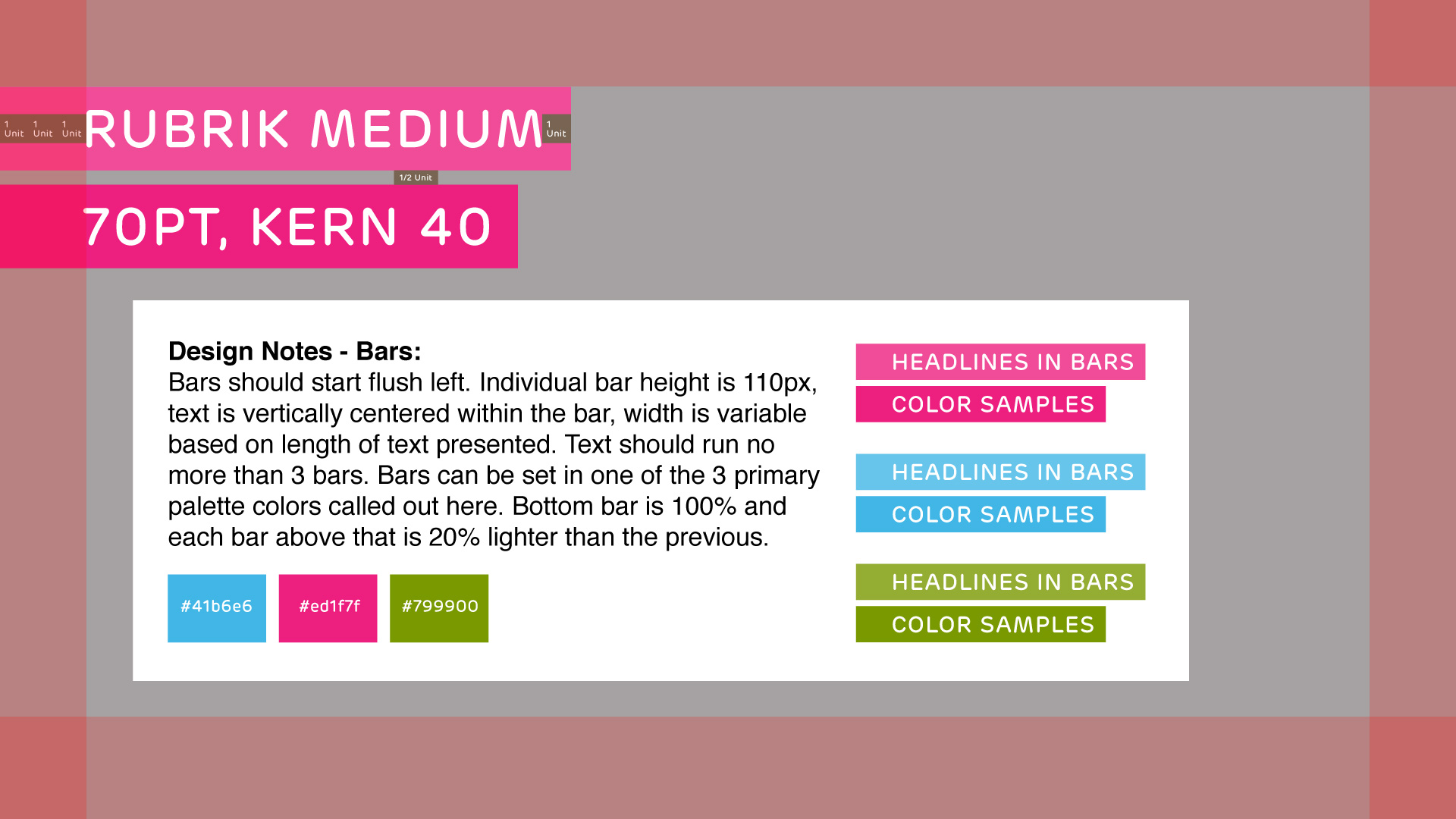
Headline Text Within Bars – NOTE: Headlines within bars should be used sparingly in video
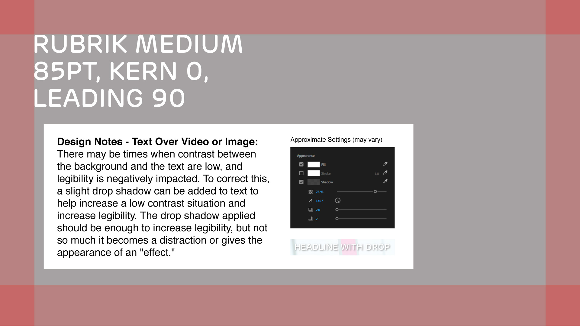
Headline Text No Bars
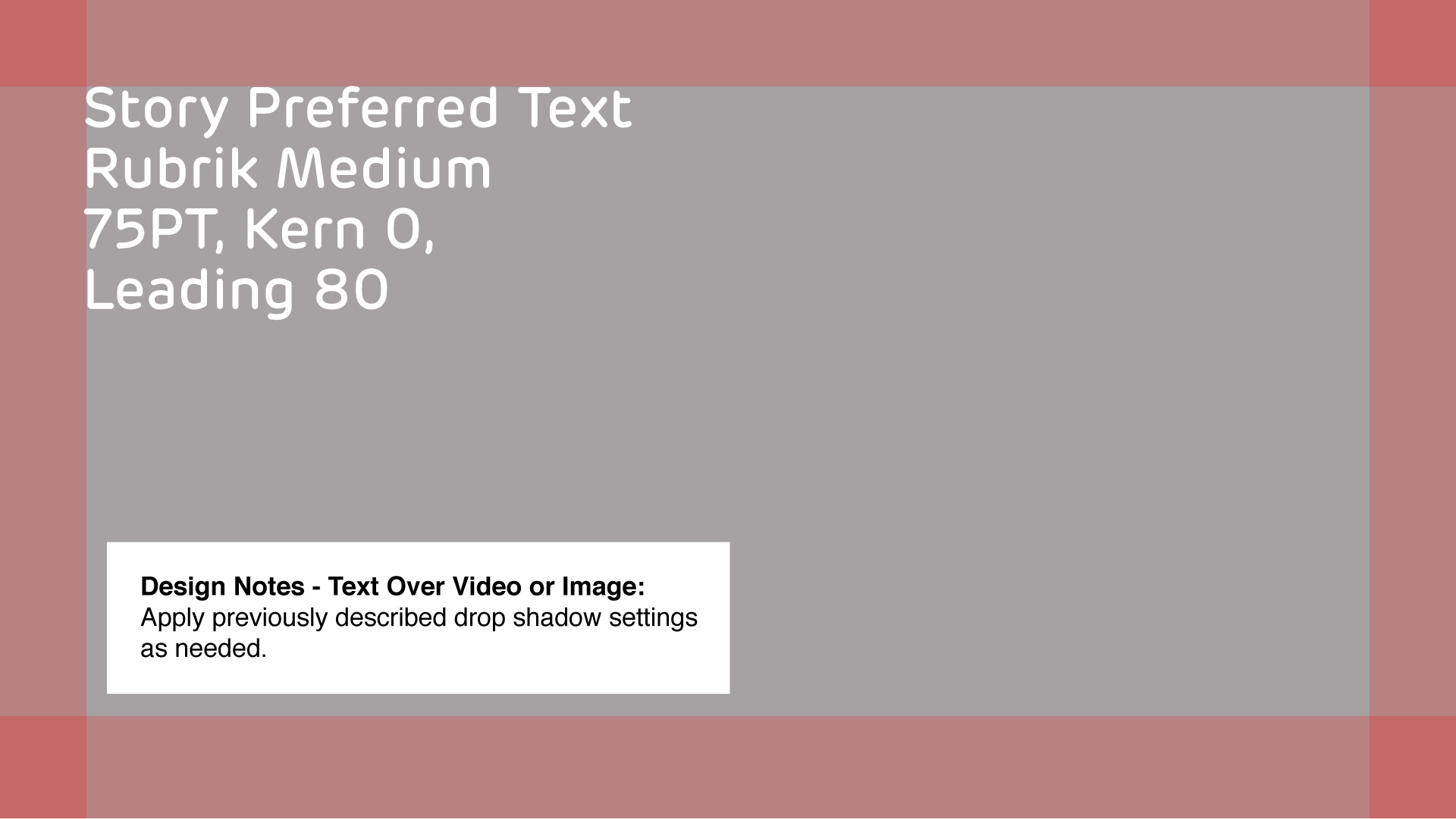
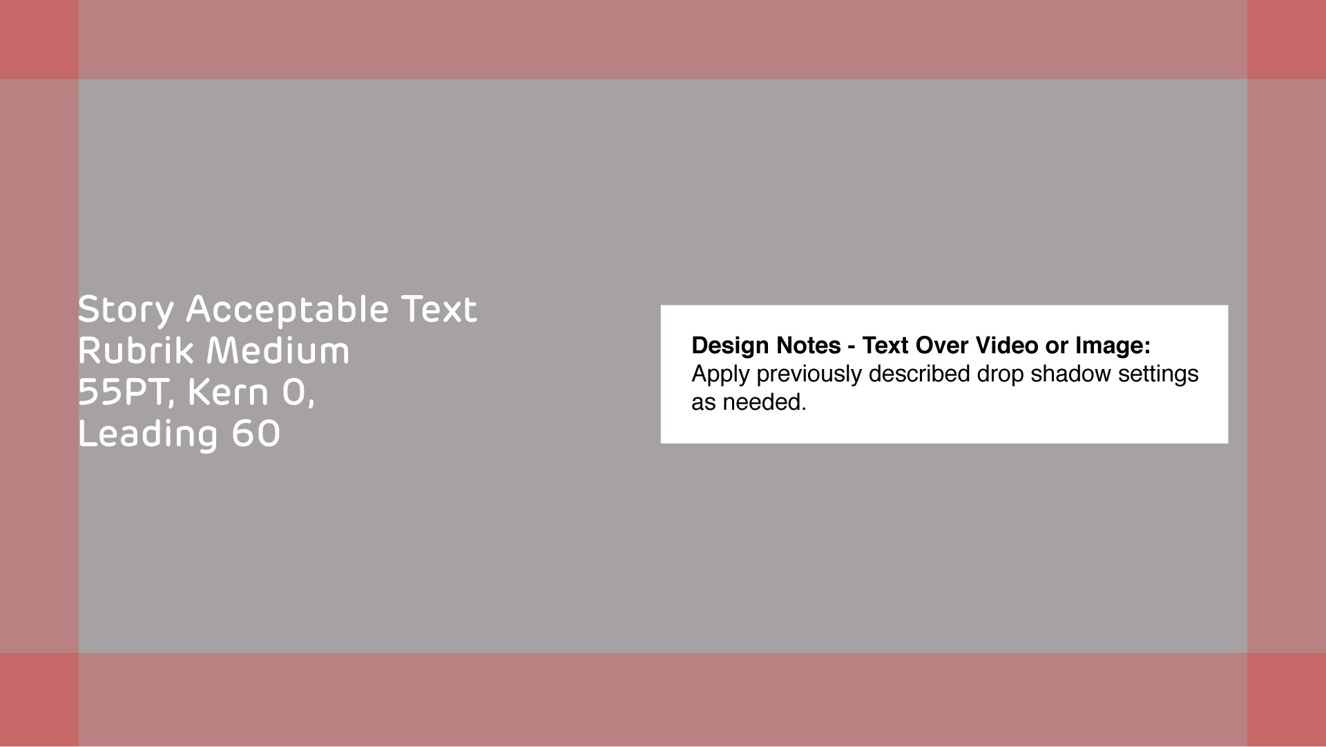
Story Preferred Text Size
Story Acceptable Text Size
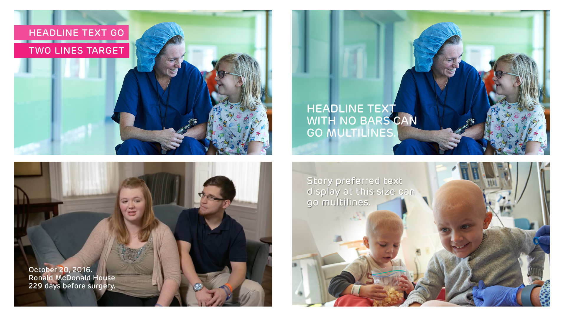
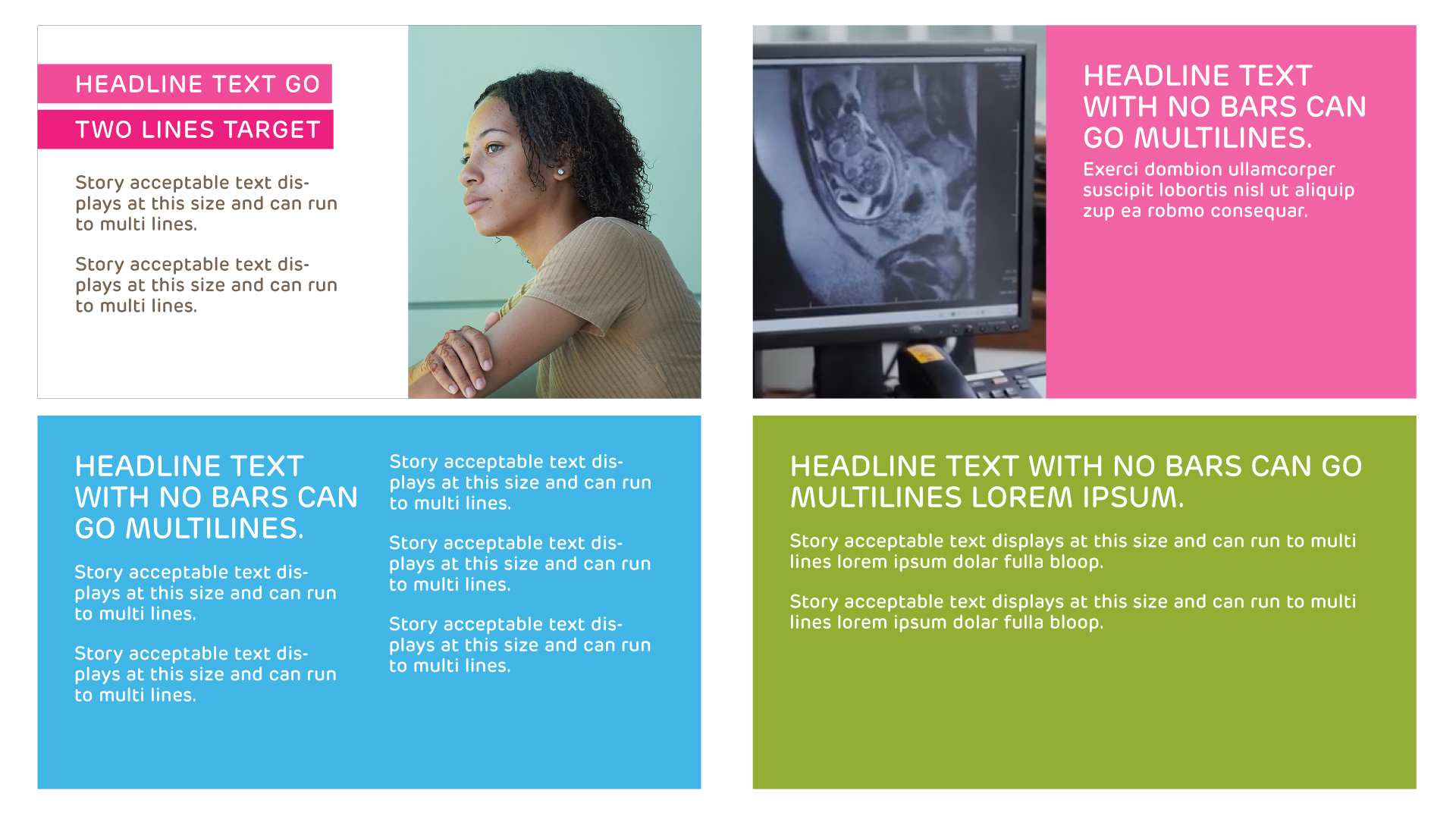
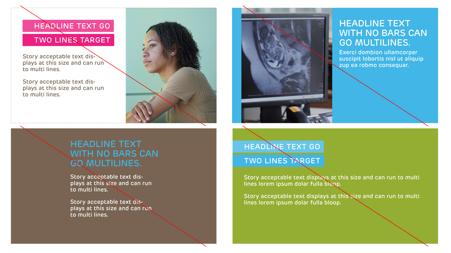
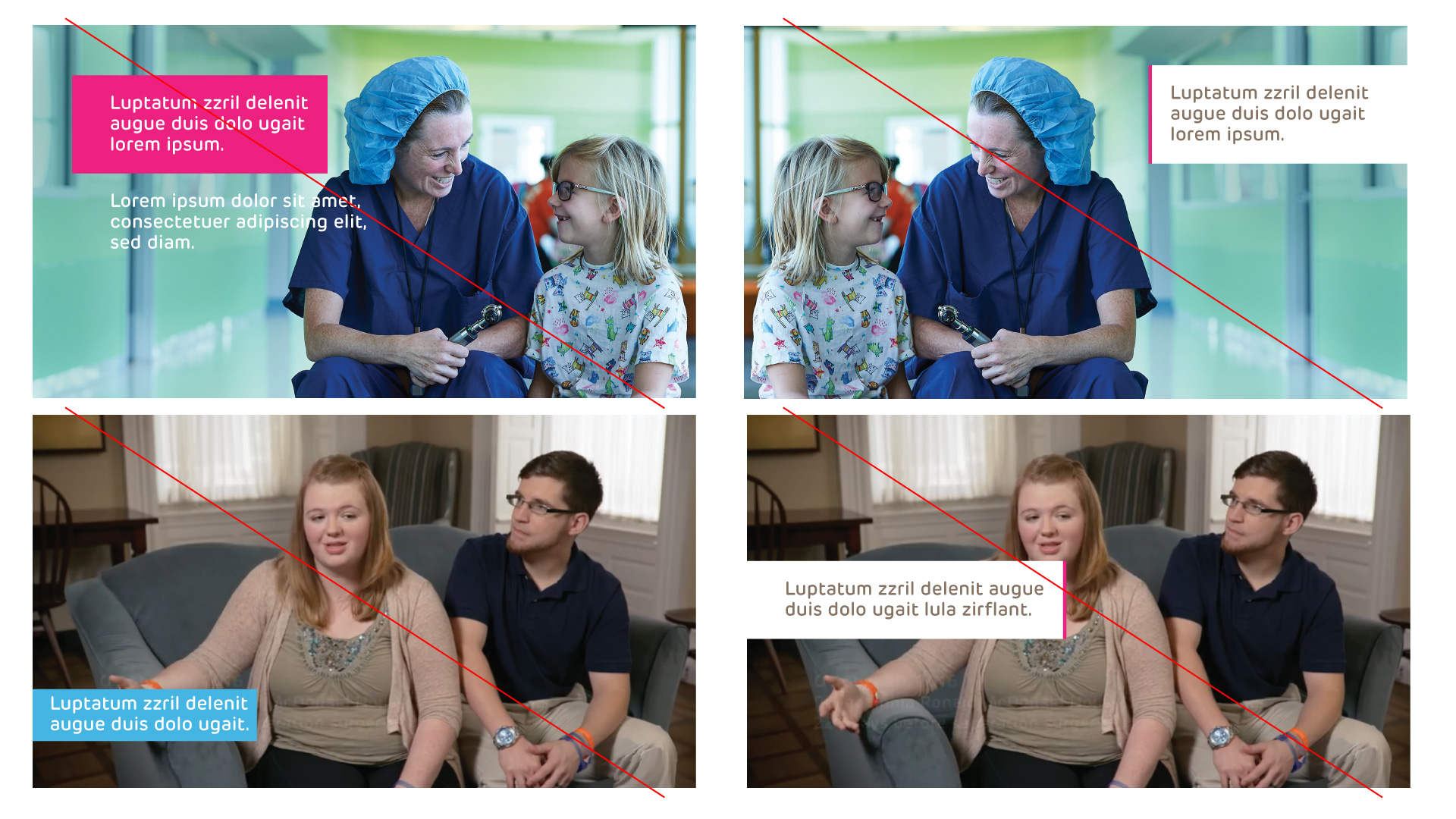
Samples of Correct Headline and Story Text
Samples of Incorrect Headline Text
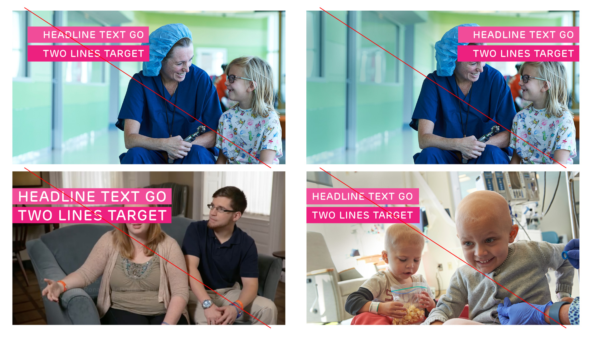
Upper Left: Incorrect stage padding – bars should position flush left Upper Right: Incorrect right alignment, Lower Left: Incorrect padding within bars and placement over subject, Lower Right: Incorrect padding within bars, padding before text needed.
Samples of Incorrect Story Text
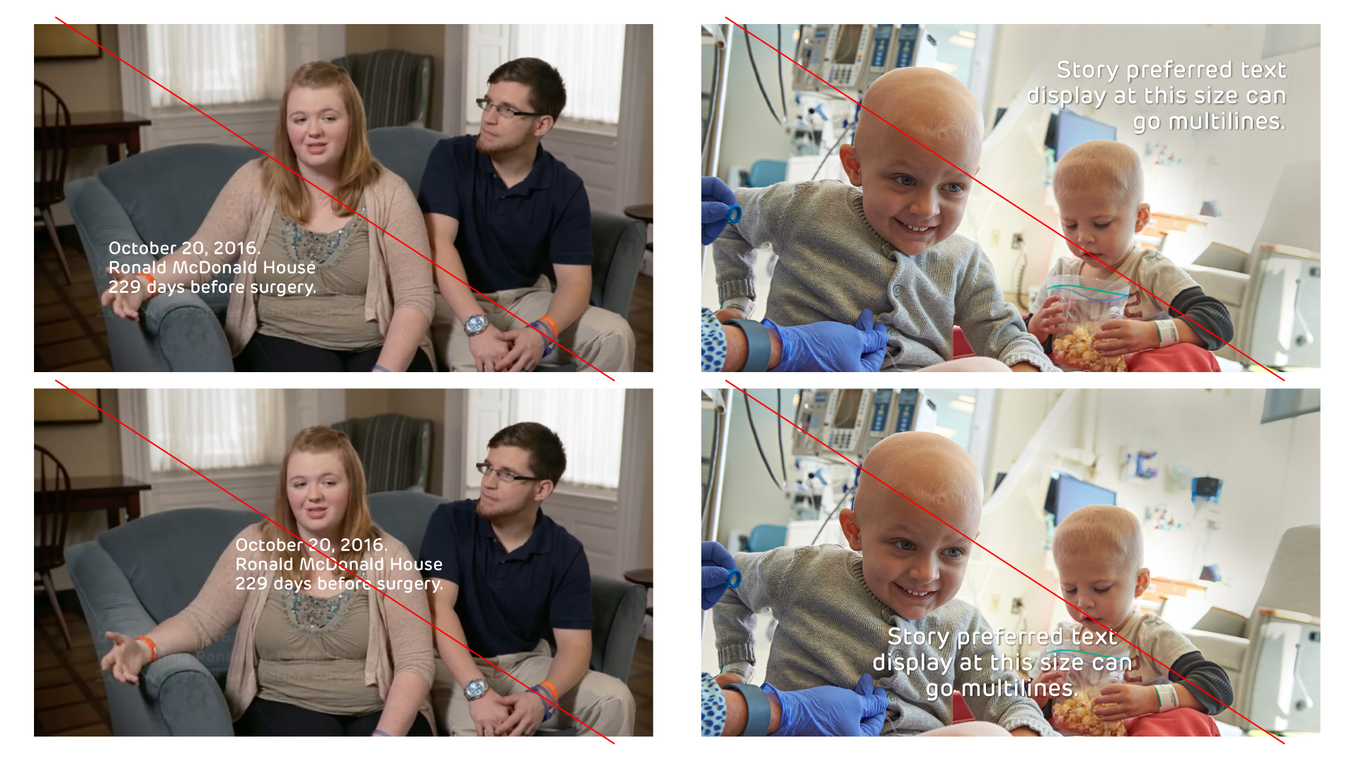
Upper Left: Incorrect stage padding – text should align with Brand Margins Upper Right: Incorrect right alignment, Lower Left: Centering is an incorrect placement, Lower Right: Centering placement and centering text is incorrect.
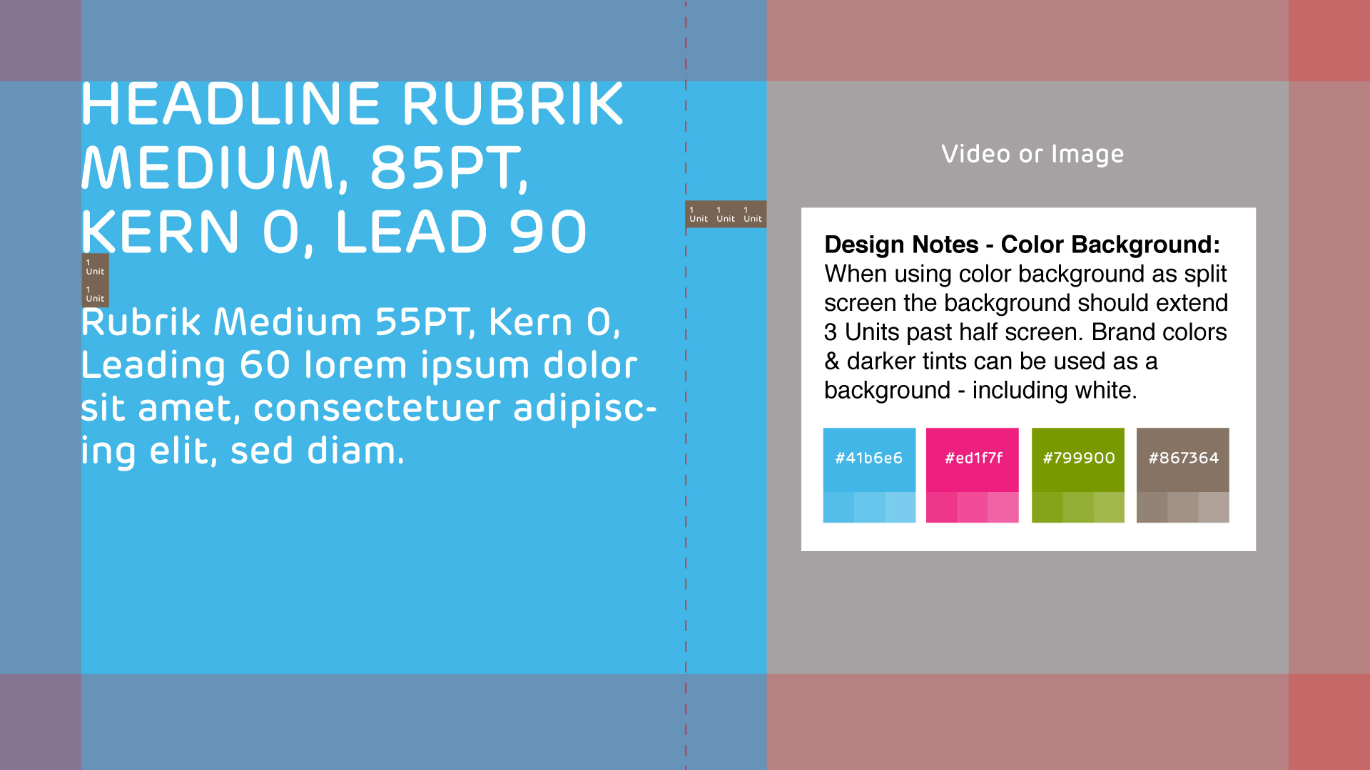
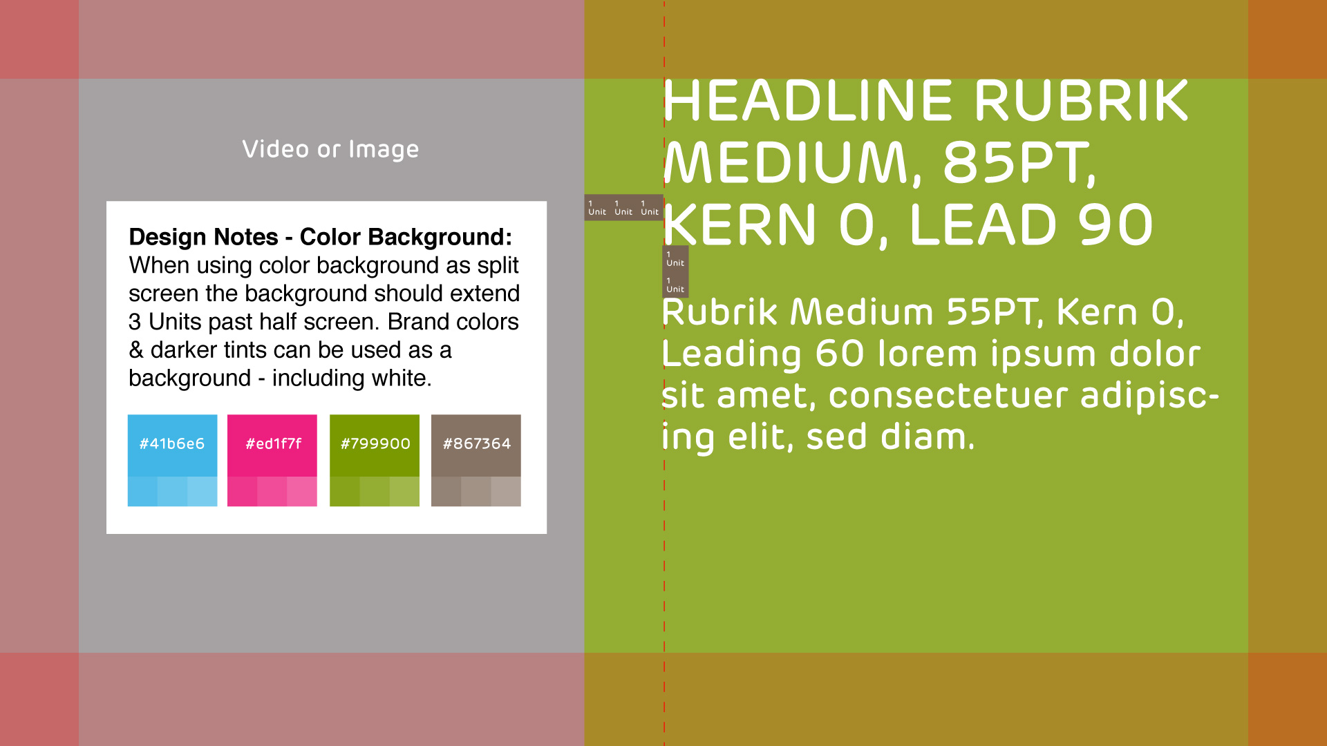
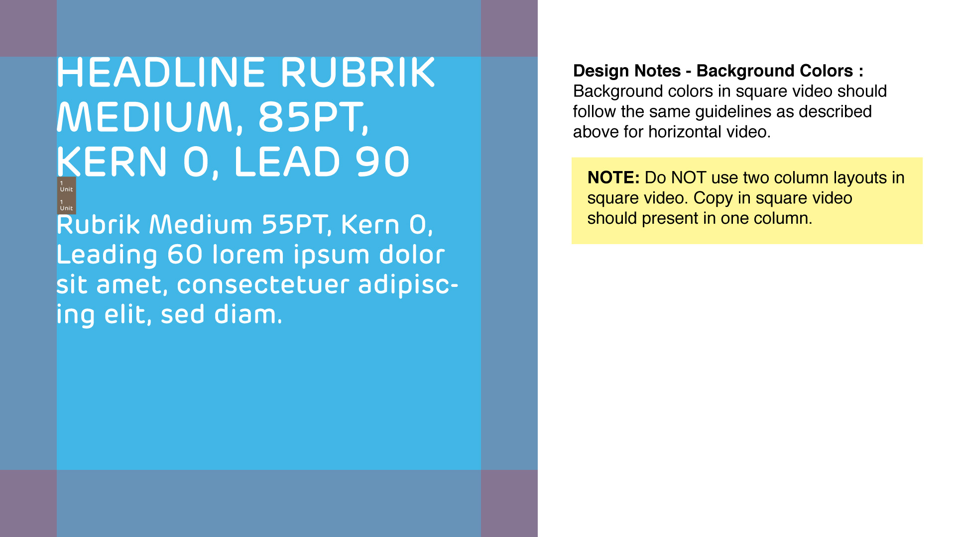
Background Colors
Split Screen Background Color Blocks
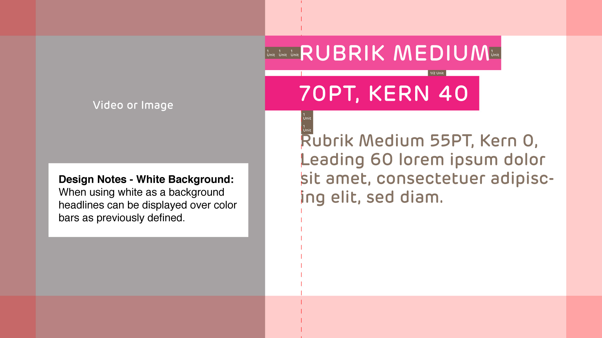
Full Screen Background Color Blocks
1 Column Full Color Block
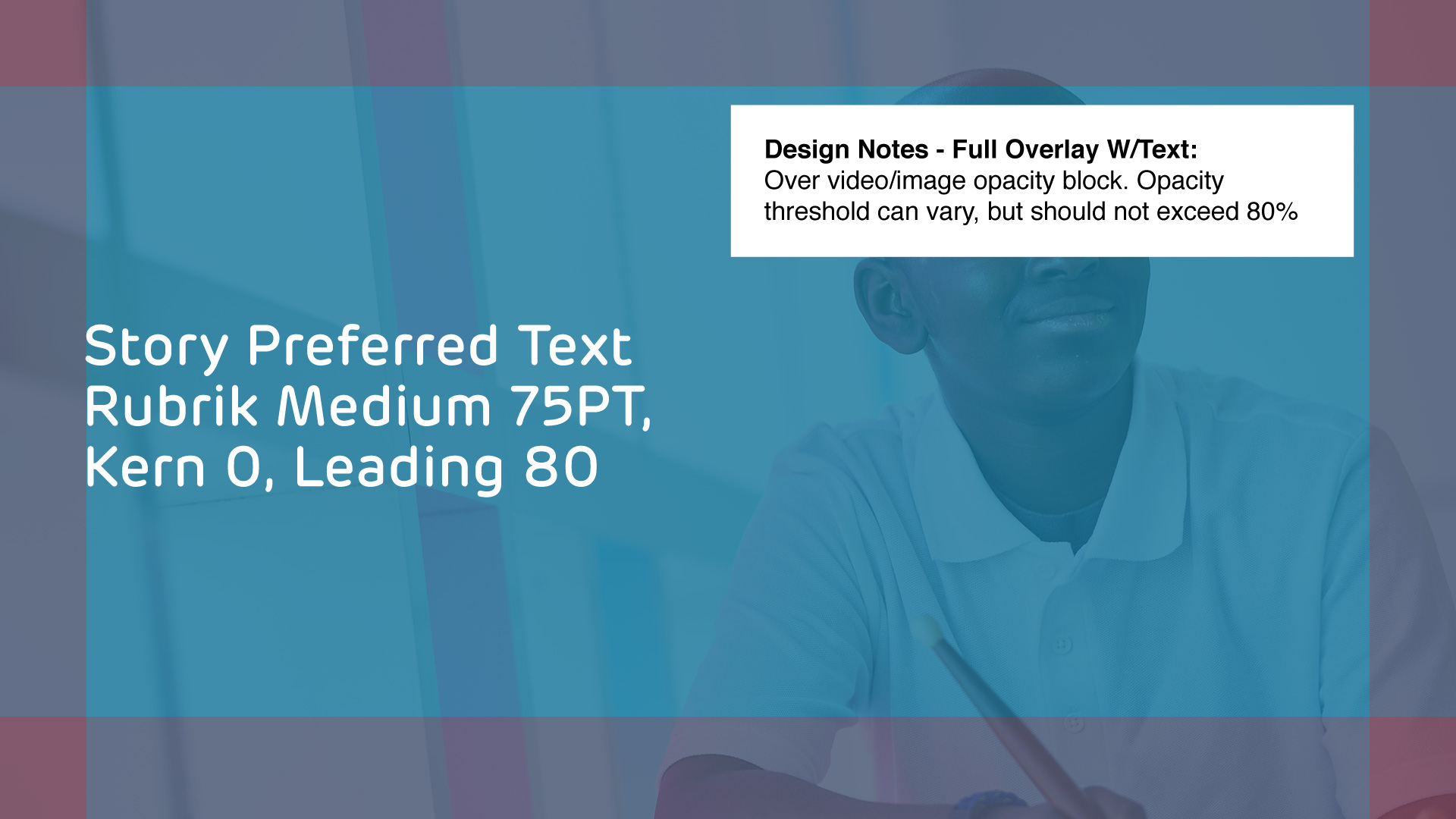
Full Overlay with Text (Intended as a transition effect – use sparingly)
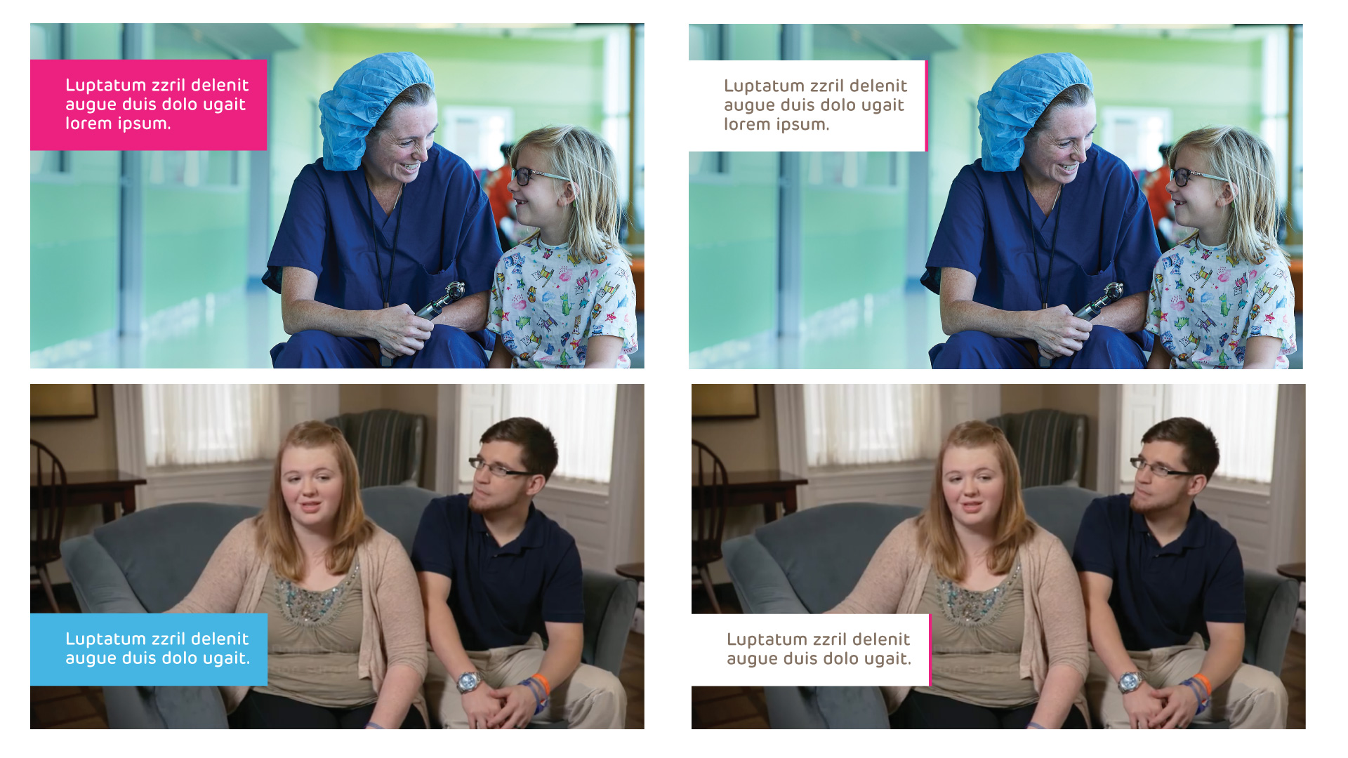
Samples of Correct Background Color Use
Samples of Incorrect Background Color Use
Upper Left: Incorrect stage padding – bars should position flush left Upper Right: Incorrect division of stage – photo should bleed off left edge, Lower Left: Centering is an incorrect placement and Headline Text should be white, Lower Right: Headline Text within Bars should only be used over white background.
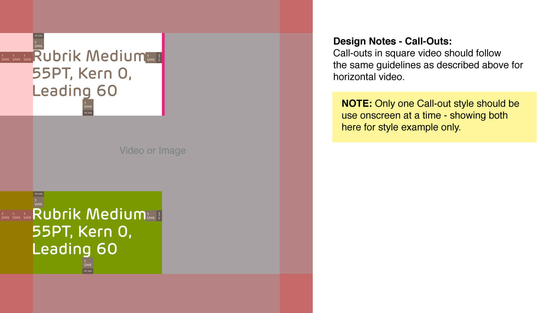
Section Call-out
Think of this design element as a way to create a pause and move on to a different thought – they are section-breakers. Section Call-outs are not intended for headlines, story text (explanatory text) or lower thirds. They also should not be paired with any of those elements. Not all videos utilize Section Call-outs.
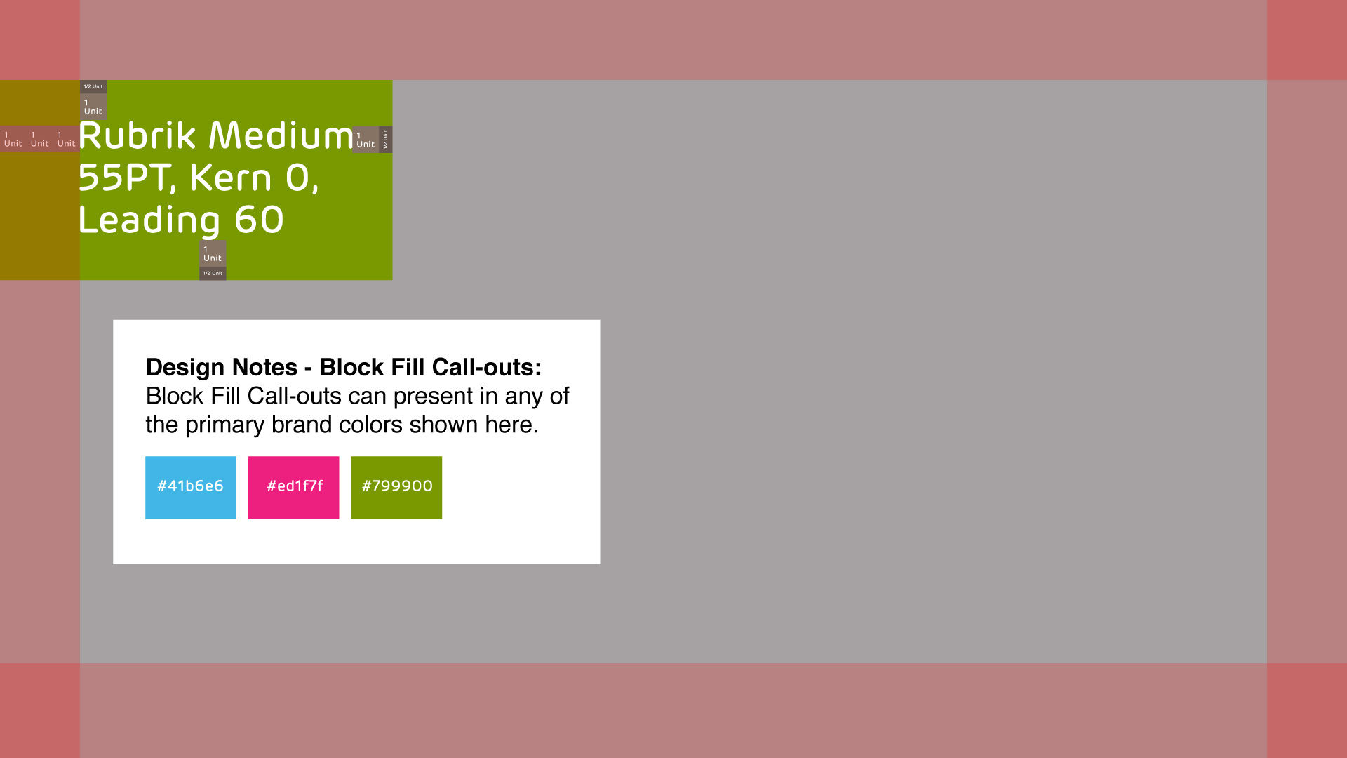
Block Fill Call-out
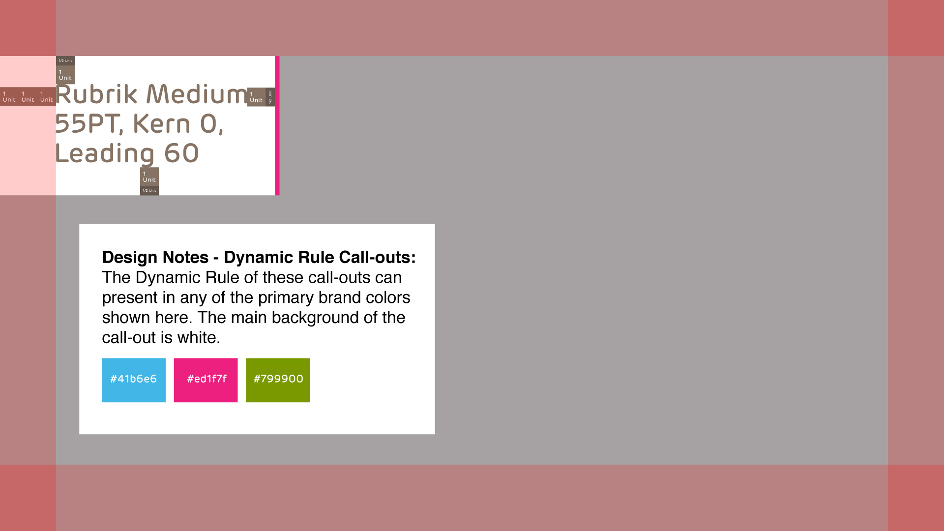
Dynamic Rule Call-out
Samples of Correct Section Call-out Use
Samples of Incorrect Section Call-out Use
Upper Left: Incorrect stage padding and pairing with story text, Upper Right: Incorrect right alignment, Lower Left: Incorrect padding within color block, Lower Right: Poor placement covering video content.
Special Use Captions
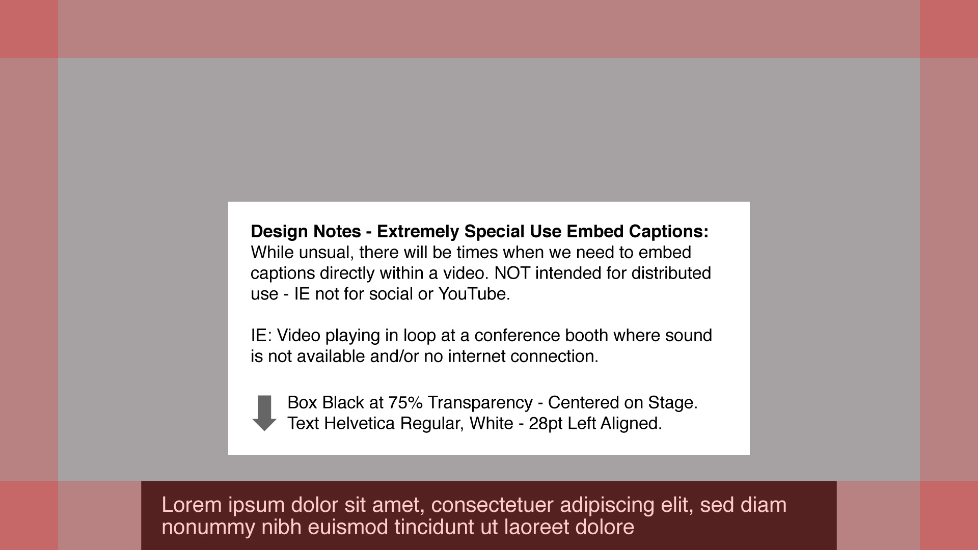
Text here is set in Helvetica – NOT Rubrik – as it is not to be considered brand element presentation – more of a functional caption.
Square & Vertical Video Guidelines (Social Videos)
NOTE: To correctly implement design elements in square & vertical video be sure to understand the horizontal guidelines explained above – square and vertical videos utilize similar design principles.
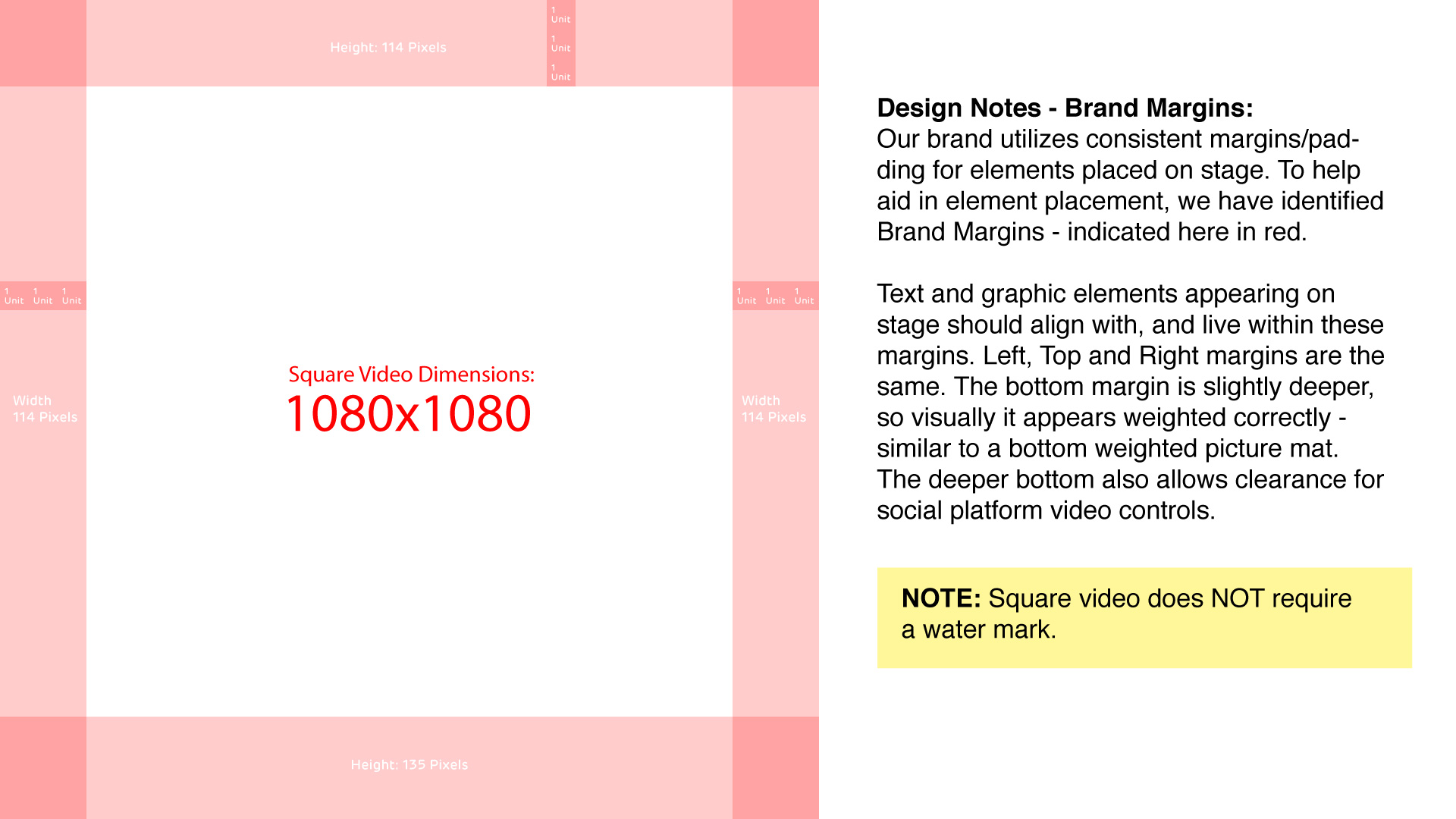
Square video should be created at a stage size of 1080×1080, and vertical video should be created at a stage size of 1080×1920. The square principles outlined below can easily be applied to vertical video.
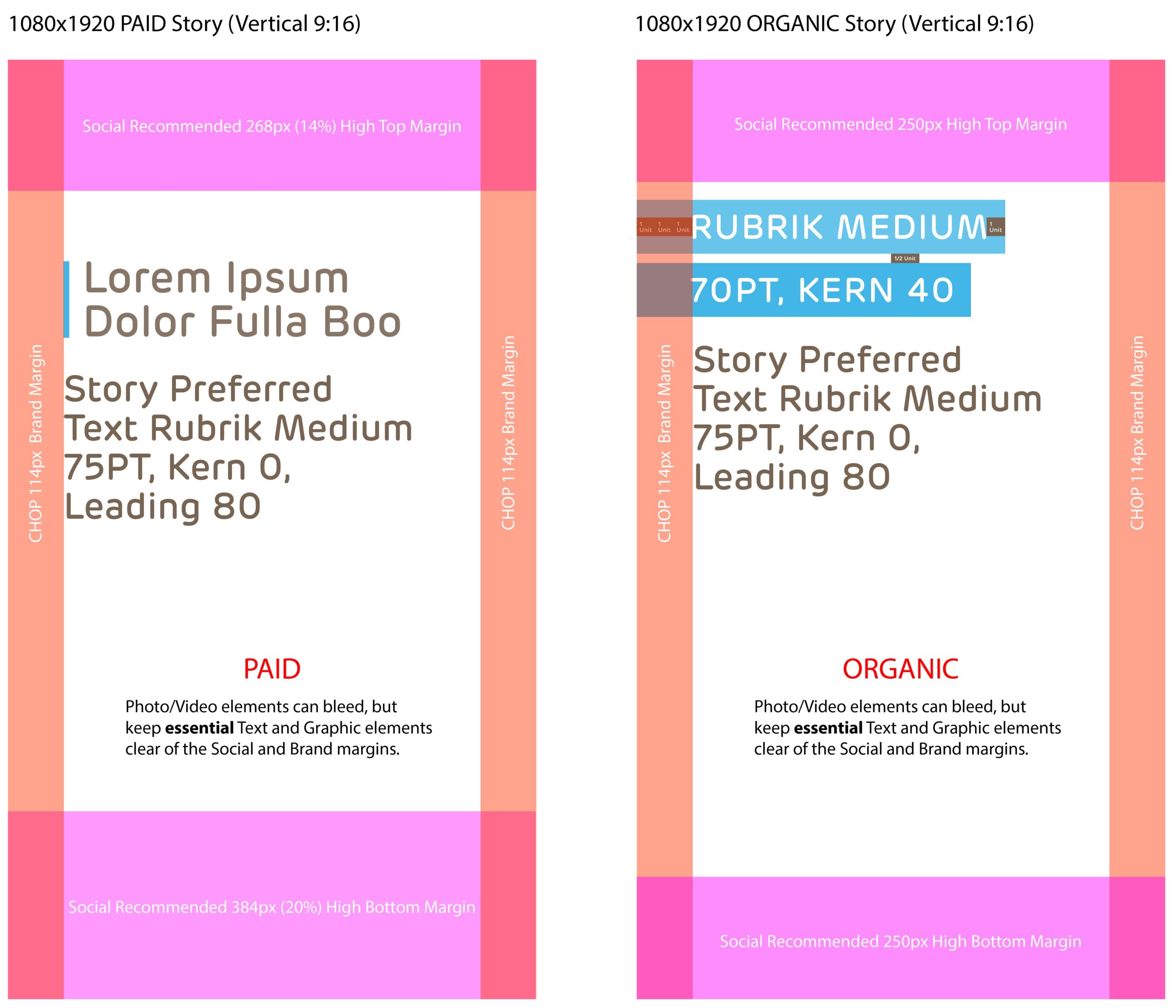
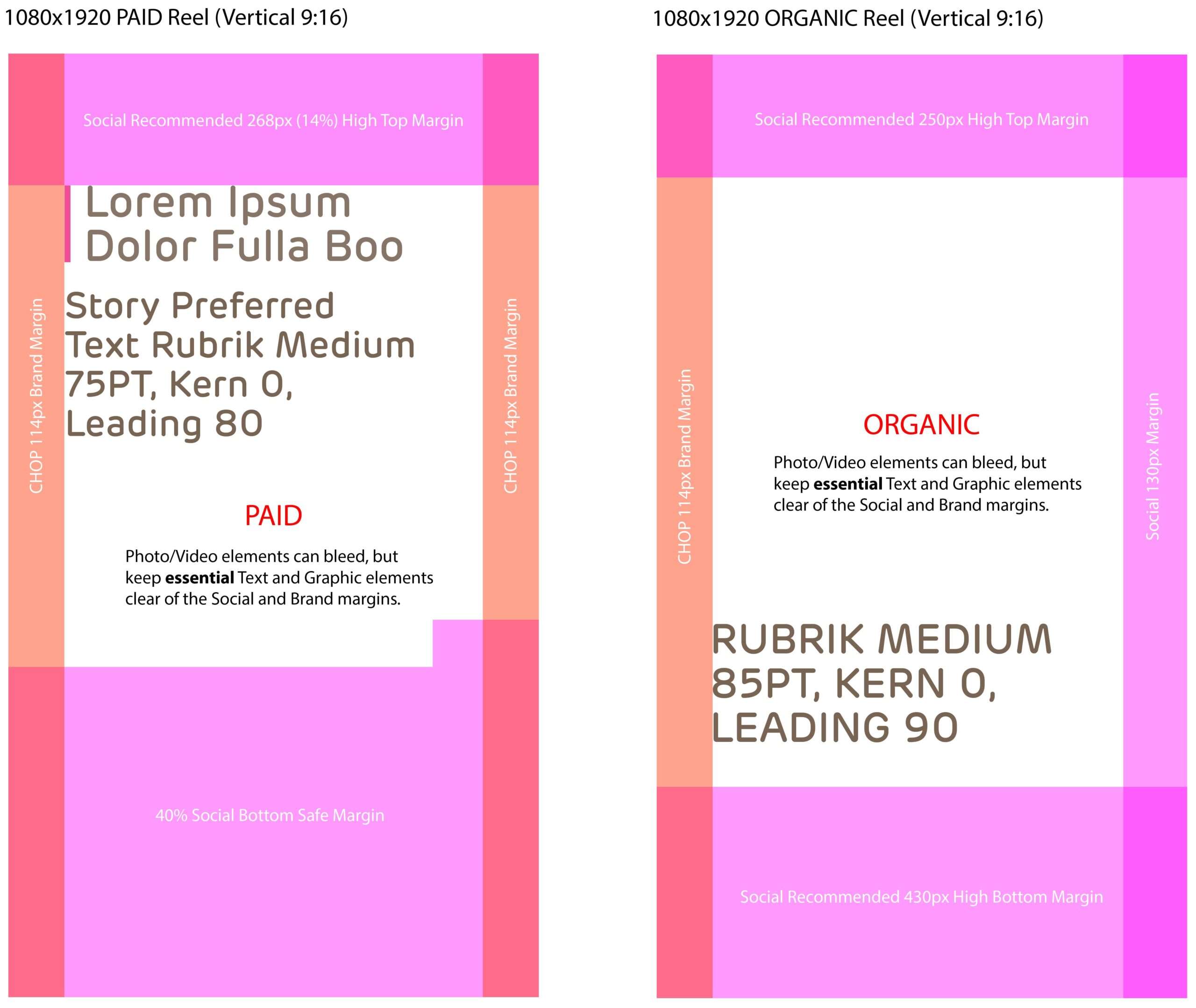
Note for Vertical Social Stories/Reels: when designing vertical video for social stories & reels (Instagram & Facebook) follow the defined top and bottom margins for story/reels videos.
Brand Margins
Would template PNG files for our Brand Margins help you? Download ZIP here!
ZIP file includes 3 PNG files, 1 file for each – Horizontal (1920×1080), Square (1080×1080), and Vertical (1080×1920) video formats.
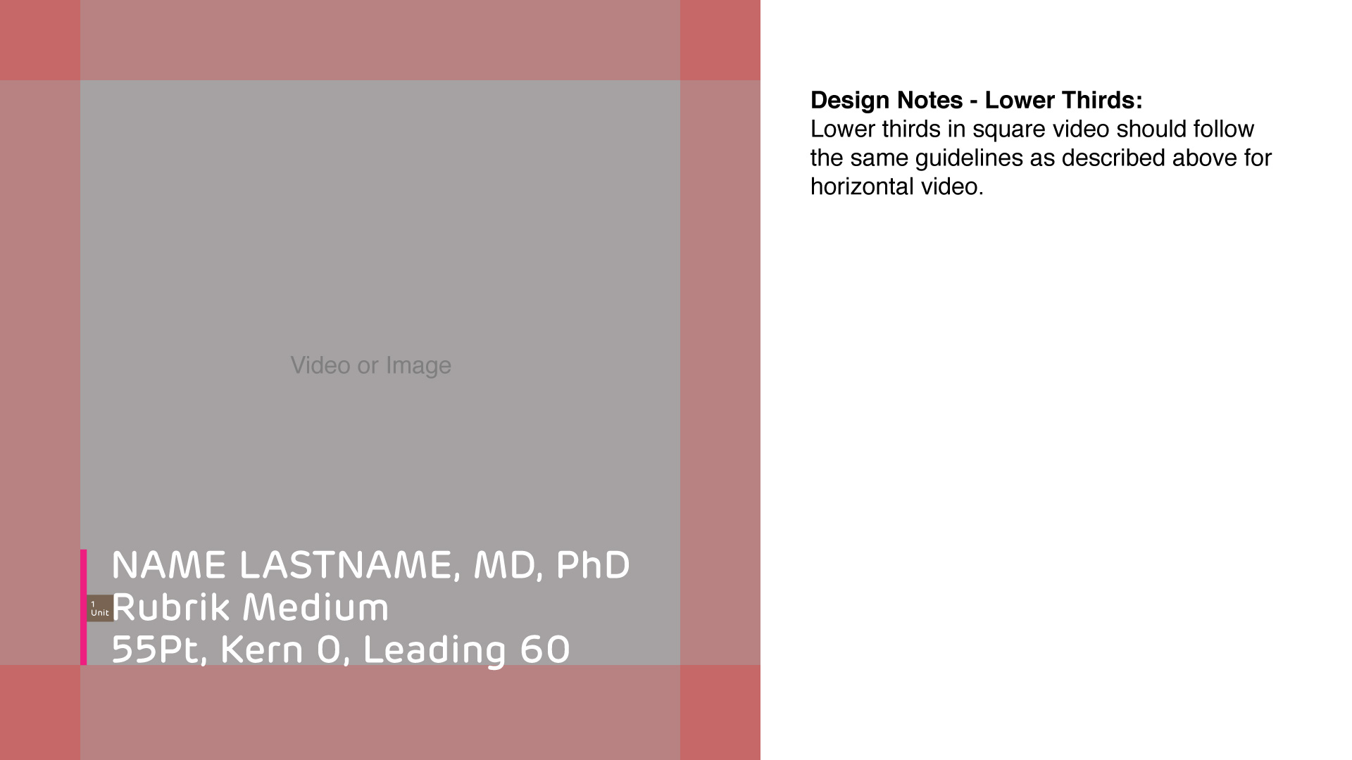
Lower Thirds
Headlines
Story Text
Background Colors
Call-outs
Vertical Margins for Instagram and Facebook Stories/Reels
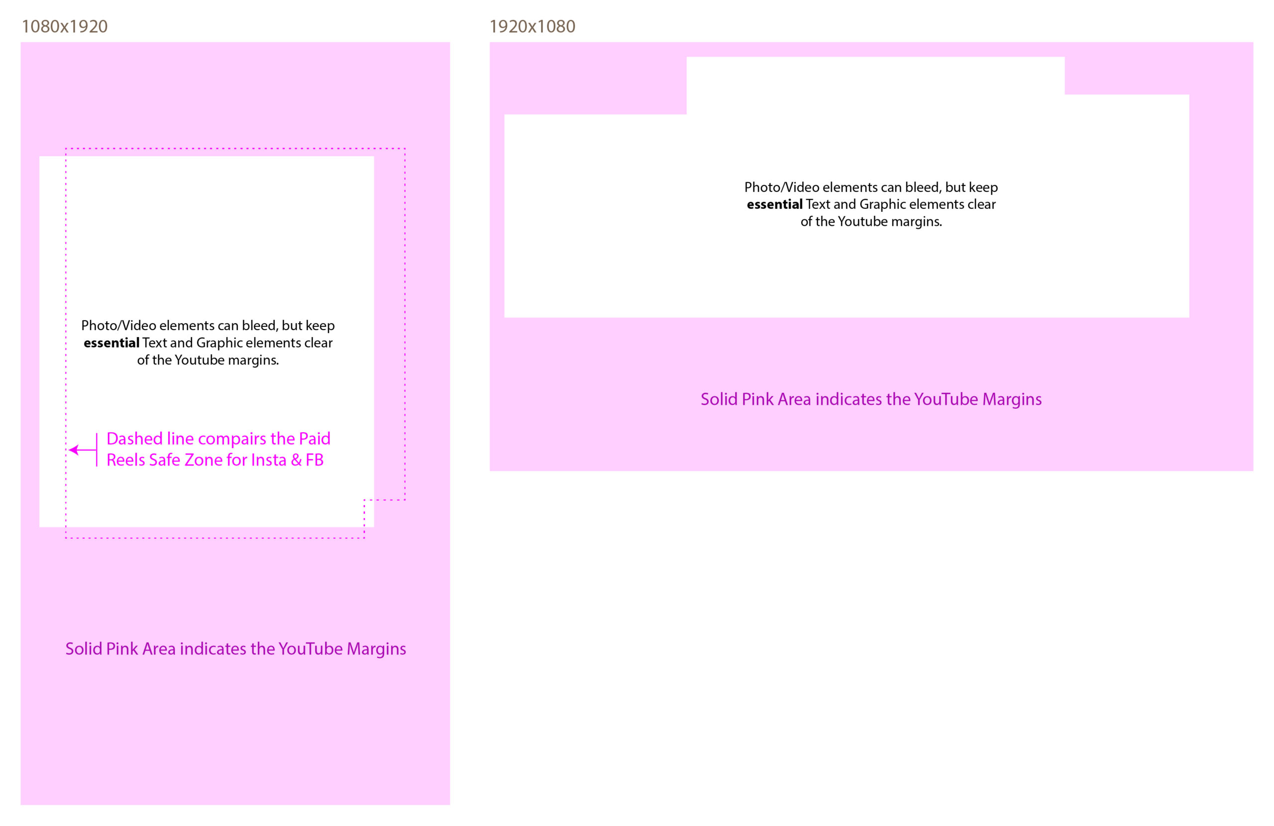
YouTube Paid Ads
YouTube Paid Ad Safe Zones
Would template PNG files for YouTube Paid Ads Help? Download ZIP here!
ZIP file includes 2 PNG files, 1 Horizontal (1920×1080) and 1 Vertical (1080×1920)